Symbio’s Redesigned Launchpad
Evaluating Symbio’s current intranet and redesigning it to reflect the needs of its globally evolving workforce.
Overview
I worked with a team of UX/UI designers to redesign their intranet platform, Launchpad. Symbio is a global software development organisation enabling service providers to deliver UCaaS and collaboration services.
The deliverables for this project included a detailed competitor analysis of other intranet providers, an analysis of the current Launchpad and whether it is fit for purpose, and potentially a high-fidelity re-designed Launchpad created with blue sky thinking.
My key contributions in this project included conducting user interviews, competitor research, synthesis, ideation workshops and usability testing as well as overall project management and stakeholder management.
Figma, Miro
UX Researcher
Role
Tools
3 weeks
Duration
The Challenge
Symbio wants to revamp its intranet system but requires more insight from Symbions into whether the current Launchpad platform is fit for purpose.
01 - Research
Understanding Symbions & their Launchpad usage
We started off research with conducting surveys and 1:1 user interviews. We made sure to get participants from different teams and Symbio locations globally. Participants included:
Survey: out of 21 responses, 74% were based in Australia, 70% aged between 35 - 54 years old and 91% used Launchpad
Launchpad usage such as how often users use Launchpad, how long they spend in a sitting, which device they use
How user friendly Launchpad is and how useful the content is
Interviews: of our 18 interviewees, 66% were based in Australia and were from a variety of roles and business divisions
What does a typical session on Launchpad look like? What activities / goals are they trying to achieve on Launchpad? Does Launchpad support or hinder your ability to complete these tasks?
If you have used a previous intranet platform, how does it compare to Launchpad?
Based on the research we performed, we gathered the following Launchpad usage statistics:
spend 5 - 10 minutes on Launchpad in one sitting and 33% spend < 5 minutes
48%
1.2x logins
users logged into Launchpad < twice a week in the past 12 months
of users access Launchpad via desktop, and 14% via mobile. 57% would prefer to also access Launchpad via mobile
100%
average rating of how useful the content on Launchpad is
3.8/5
average rating of how user friendly Launchpad is
3.5/5
01 - Research
The intranet landscape
Other key players providing intranet platforms include:
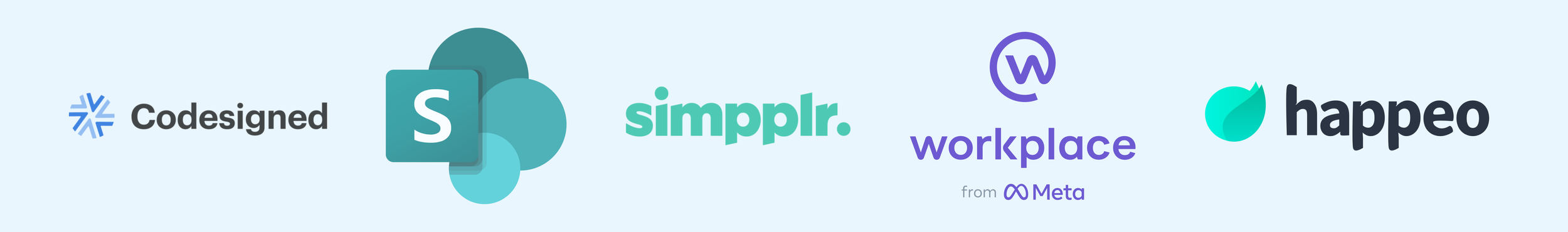
We compared other intranet providers with Reward Gateway, Symbio’s current provider, and have the following takeaways:
Reward Gateway’s main value proposition is providing rewards and discounts for employees
Sharepoint is used by 2500+ organisations and focuses on document management. Sharepoint integrates best with other Microsoft products
Intranet Pro by Codesigned is an intranet add on that works with Sharepoint and is known for it’s powerhouse search capabilities
02 - Synthesis
Synthesis
In order to synthesise the research we have obtained, we created an affinity map to identify the biggest clusters and most common themes. The most frequent sentiments we found could be categorised into 3 key areas:
“Just a pain to login - makes you want to not open it unless you really have to for a specific reason.”
“..sometimes you have things buried in a menu buried in another menu that you won't know about.”
Accessibility

“Probably needs to be adaptable to each persons use. Should also have a page to link all your apps needed”
“I'd like something that I can personalise so I can make it work for me.”
Personalisation

“I thought the intranet would have all the corporate information in there.. But it’s still a combination of going to two places.”
"I find that Launchpad is too Australia-centric."
Content

02 - Synthesis
Key Pain Points
Our affinity map of synthesised research also showed several recurring pain point areas with Launchpad:
“The search function isn’t very intuitive”
It is difficult to find information on Launchpad and the search bar is not optimised to return relevant information.
Ineffective search & navigation

“[A pain point is] that I cannot organise my own dashboard as what is important to me may not be important to someone else”
Information is not tailored to each user to promote maximum engagement and relevancy.
Lack of personalisation

“I would like to feel a better sense of belonging to the company.”
Launchpad communications and company updates are largely Australia-centric.
Lack of inclusivity

“I thought the intranet would have all the corporate information in there.. But it’s still a combination of going to two places”
It is annoying and time consuming to go to multiple places to try and find relevant resources e.g. is it on Launchpad or Confluence?
Decentralised resources

“Sometimes when I need to cross-check something with someone in a different part of the world, they have a public holiday... something I wasn’t aware of.”
Symbions aren't sure of timezones and public holidays in global Symbio offices and this can affect their ability to work efficiently.
Lack of global communication

“I'd prefer it if I didn't have to jump through hoops to sign on”
Login to Launchpad is time consuming and repetitive. Single sign on still requires 4 - 6 clicks to login to the platform.
Time consuming login

Based on our synthesis and affinity map, we are aware of many potential areas in which Launchpad could be improved. We decided for the scope of this project to come up with one problem statement to focus our solution on:
The problem
Symbions feel frustrated about accessing resources they need on Launchpad due to inefficient search and navigation.
02 - Synthesis
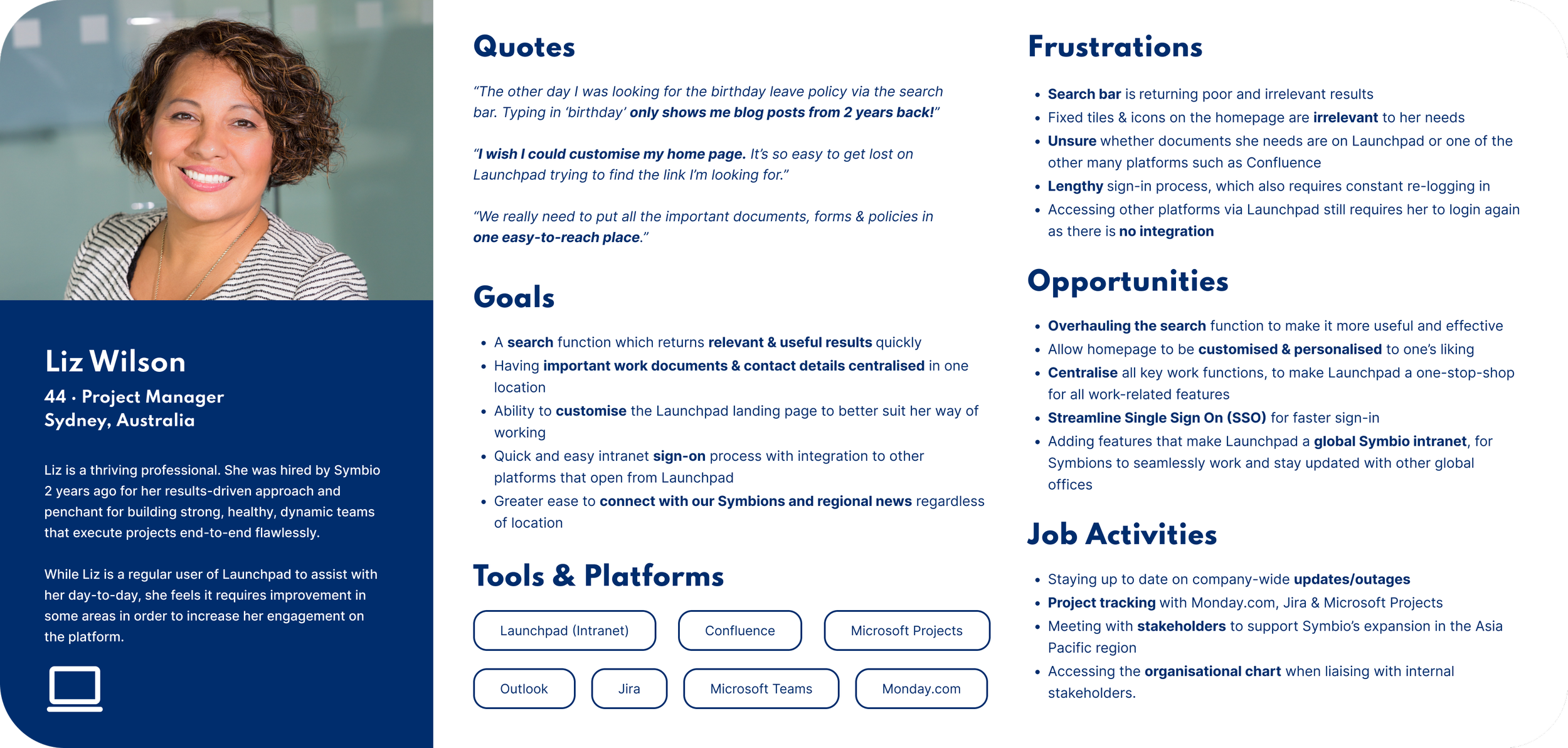
Introducing Liz & James
We found that we had 2 distinct personas that had differing pain points based on their location globally. Therefore, each persona is representative of all our synthesised research which also helps us clearly define who we are designing for. Moving into the ideation phase, our designs will aim to solve Liz & James’ frustrations, and address their needs and wants.

03 - Ideate
Brainstorming for Potential Solutions
In order to generate ideas, we ran ideation workshops with Liz & James and focused on 2 How Might We questions:
Based on the ideas generated and voted on by Liz & James we placed them on a Minimum Viable Product (MVP) matrix, which considers the level of effort and value each idea has.
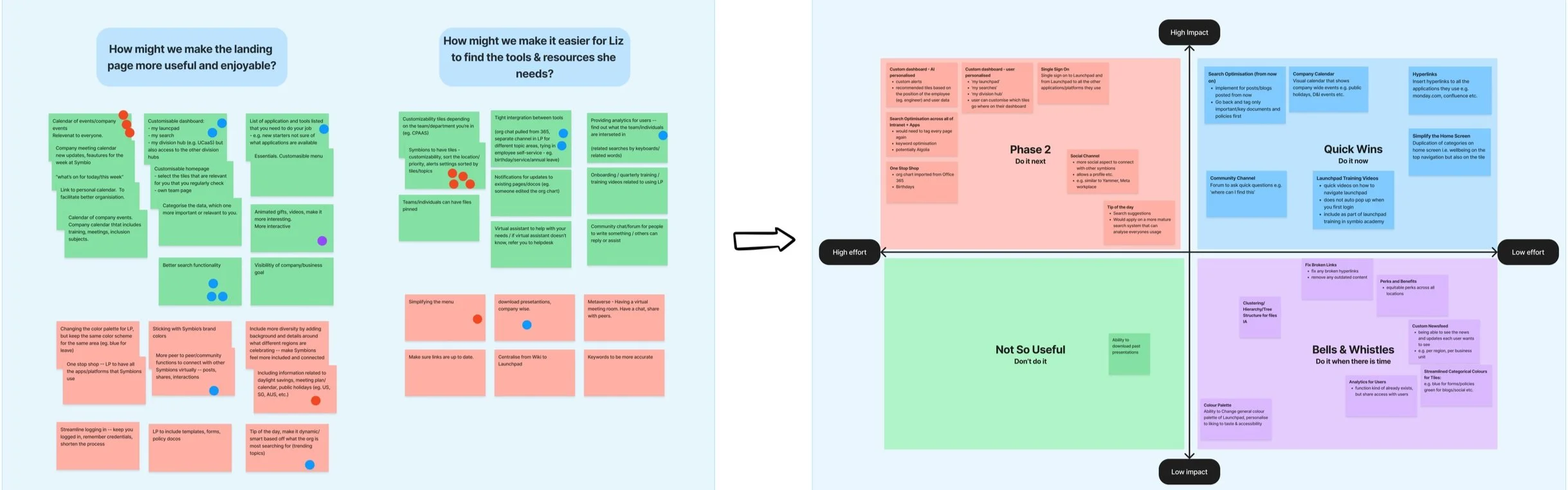
We focused on 3 key ideas from the Quick Wins and Phase 2 quadrants. We decided to include Phase 2 features as the client had encouraged us to apply blue sky thinking:
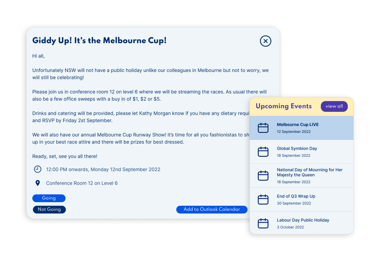
Upcoming Company Events Highlight - a calendar highlighting company events globally with the option to RSVP and add the event directly to Outlook
1
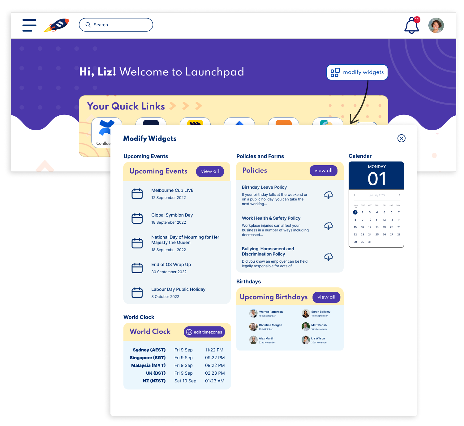
Customisable Dashboard - users can choose which widgets and features are on their landing page
2
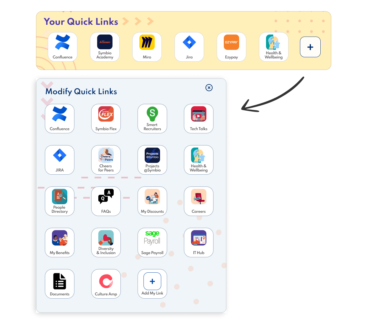
Customisable Quicklinks - users can customise their quick links to their most used apps or platforms
3
03 - Ideate
Features to the redesigned Launchpad
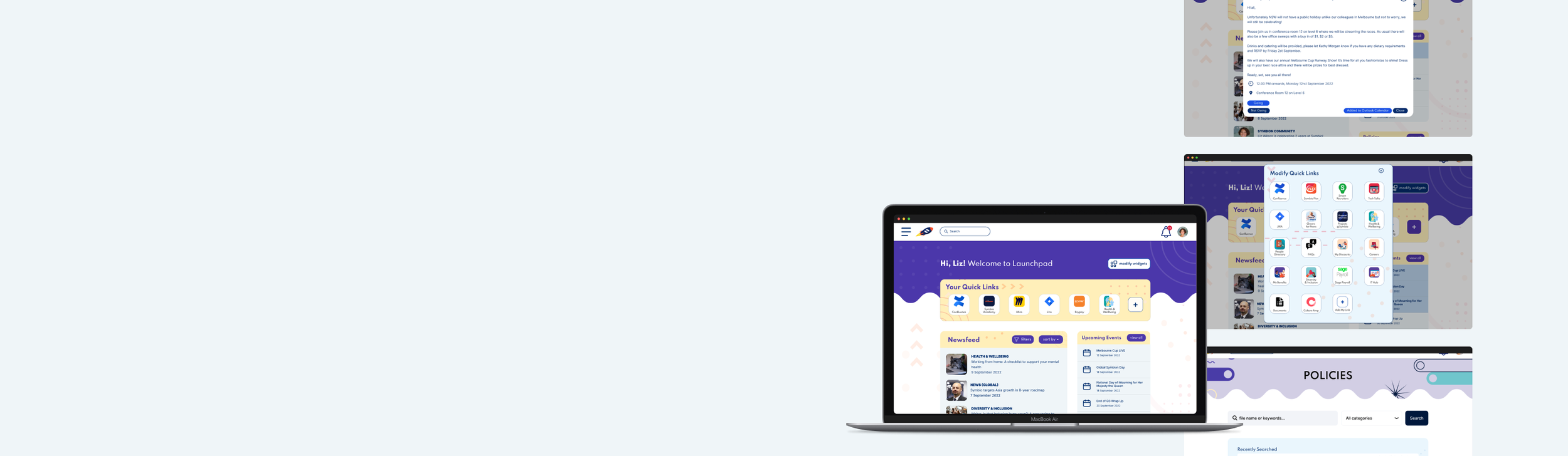
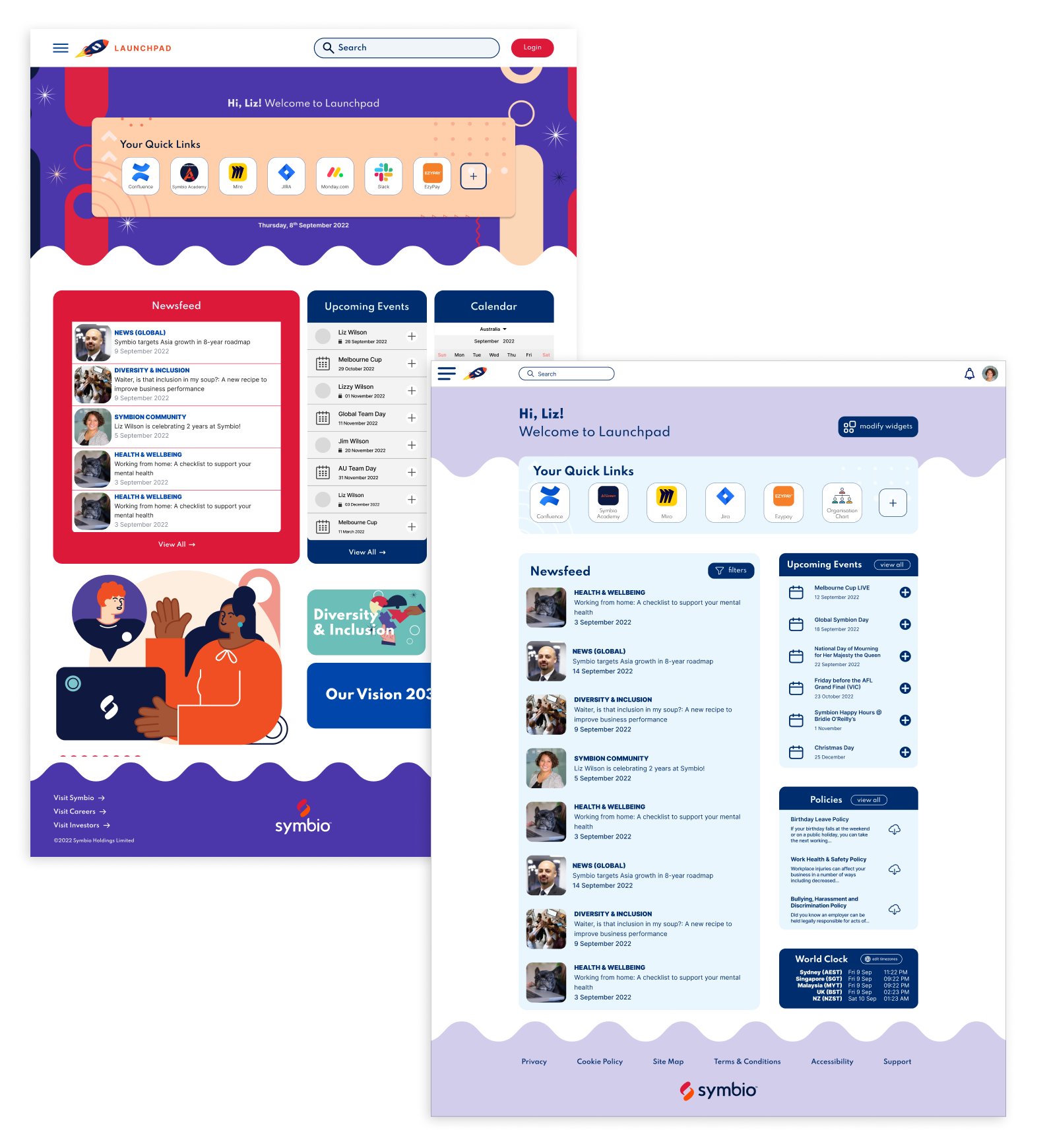
Based on the key features from the MVP we designed the most highly voted on features and built them into the landing page:
Upcoming Events
A list of upcoming company events, globally. This includes public holidays, events, company wide meetings etc. Users also have the option to RSVP and add the event to their Outlook calendar from Launchpad.
Addresses the pain point of lack of global communication and lack of inclusivity as users will be aware of key events happening in other Symbio offices globally
Customisable Quicklinks
In addition to a customisable dashboard, there is also a quicklinks panel where users can add their most accessed platforms and applications. Users can also save links to documents or policies they refer to the most.
Addresses the pain point of lack of personalisation and ineffective search and navigation as users can quickly navigate to their most used platforms as the panel is prioritised at the top of the page rather than hidden behind a menu
Optimised & Customisable Dashboard
Users have the option to modify the widgets on their landing page to include the features they would use the most.
This addresses lack of personalisation and ineffective search and navigation as users can optimise their landing page to best support their day to day needs.
It also improves global communication for example if users work with team members globally, they can add the world clock and upcoming events to stay in touch.
04 - Validate
Preference Testing
Throughout usability testing rounds, we conducted preference testing to understand which features Liz and James would find the most useful. Results from preference testing determined which features we decided to feature and keep and which ones we didn’t.
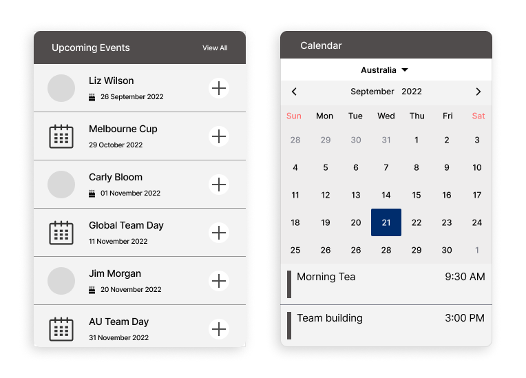
Upcoming Events vs Company Calendar
5/8 found upcoming events feature useful
6/8 questioned the usefulness of the calendar as they already use the calendar on Microsoft Outlook
“Having both upcoming events and calendar can be confusing because I’m not sure if they do the same thing”
“The events are quite crucial, because we want to know what’s happening within Symbio”
Therefore, we prioritised Upcoming Events on the landing page, and left calendar as an option for users to include when they modify their widgets.
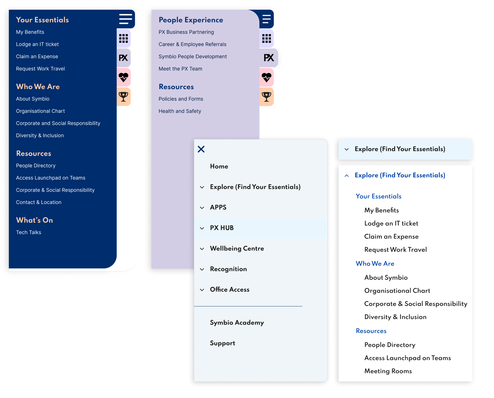
Accordion Style Menu vs Tab Style Menu
We A/B tested 2 different styles of menu navigations (accordion and tab style). We split testers into 2 groups to test each menu style.
We found that the usability test scores did not have any drastic difference between the 2 different menu styles.
For the tab style, we received feedback that a user was unsure what the new icons meant and would need to spend some time learning them
We also received positive feedback that the new menu is easier to navigate than what is currently on Launchpad
Therefore, we decided to keep the accordion style menu for the next iteration as there was less of a learning curve.
Visual Preference Test
5/9 Indicated they want the colour scheme to be brighter and more lively
5/8 preferred the left option to see brighter colours, and have Symbio's colours reflected in the intranet.
“Very plain at the moment. If we’re advertising our brand with a certain colour, I think this kind of form should reflect that as well” (referring to option on the right)
“The colours in the left option are very lively and bright"
Therefore, for the next iteration we modified the colours to better reflect the Symbio brand colours.
04 - Validate
What Symbions are saying
When comparing what Symbions said at the beginning about the current Launchpad versus what they’re saying about the re-designed Launchpad, we can see that the new design addresses their concerns regarding visual aesthetics, accessibility and desirability of the features.
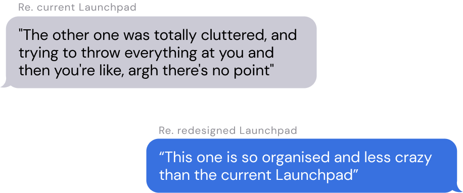
Visual aesthetics

Accessibility
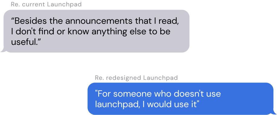
Desirability

The Redesigned Launchpad
The key priority for the next iteration of the interface was including more colours that were representative of Symbio’s brand, however making sure the landing page didn’t become too overwhelming like the current Launchpad.
Recommendations
The redesigned Launchpad interface we had built did not take into consideration a particular intranet provider but incorporates blue sky thinking. It includes features such as modifiable widgets which may not be offered by intranet providers, however directly addresses Liz and James’ pain points.
We recommend that Symbio consider adopting Sharepoint as their intranet provider, as it does include many features that tackles Liz & James’ pain points with benefits such as:
customisability and adaptability
lower cost as Sharepoint is part of the Office 365 suite which Symbio already has
easier integration as Symbio already use Microsoft tools in it’s work ecosystem such as Project, Teams & Outlook
other offered features include events timeline, employee directory, quick links, live tiles, world clock and more. These are features that we have incorporated into our redesigned Launchpad which we ideated by Liz & James during the workshops
Sharepoint intranet doesn’t come with a webpage interface, and therefore Symbio could use the interface that we have designed.
We also recommend that Symbio consider IntranetPro by Codesigned as an add-on, largely for their comprehensive search engine which includes smart suggestion and predictive search built in. This would directly address Liz & James’ pain point that the search function is not very intuitive as currently it only returns pages and articles.
To address the last pain point of time consuming login, we recommend that Symbio consider implementing true single sign on (SSO) to login to Launchpad. This could be achieved using a plugin such as Okta, or with SSO configuration via Windows/Azure AD. This would reduce the time taken to login to Launchpad from 4 - 6 clicks currently, to 1 click. Further, Liz & James also expressed that it would be helpful if Launchpad became the default browser homepage, and thus logging in would be eliminated entirely.
What the stakeholders had to say
"Working with Academy Xi students was an enriching experience. They took the time to understand the brief and engaged stakeholders with empathy and understanding, rapidly synthesising complex information and uncovering pain points. Not only did they delve deeply into the subject matter, but they also took us along on the journey - from problem statements, customer journey mapping, wireframes through A/B testing to the final deliverables."
- Matt Allison, Content Strategist, Product, Marketing & Innovation Manager @ Symbio
"Thank you for the fantastic work that was done on this project. It was great to hear your insights following your conversations with our employees and to see how you used that information to create a new intranet in such a short period. We will definitely be considering the feedback & suggestions as part of our ongoing review of Launchpad."
- Hardip Kaur, Head of strategic Business Partnering @ Symbio
"A big thank you from all of us at Symbio! You have not only hit all the requirements and criteria that we have asked of you, but you have delivered our Launchpad review & Symbio intranet redesign in a tight timeframe that is above and beyond what we could have hoped for."
- Sylvia Xu Connor, Senior UX/UI Designer @ Symbio
04 - Validate
How do we know we have succeeded?
To measure the success of the re-designed Launchpad, I would evaluate the following:
Whether the average number of logins per user has increased
1
Whether the number of active users has increased
2
Whether number of view posts and reactions has increased, particularly from those in global locations
3
Feedback received from Symbions from a survey
4
Design is always iterative; the next steps
The beauty of design is that there is always an opportunity to reflect, iterate and then improve. After performing a retrospective, I’d like to work on the following as next steps for this project:
More Stringent A/B Testing
As we we did not get a strong definitive and clear result between option A or B of the accordion or tab-style menu, further A/B testing with more stringent parameters and activities to test would be beneficial. Additionally, the latest iteration had changes to the colours featured on the landing page, however these should be tested further with Liz and James as colour was frequently commented on throughout testing.
01
Assessing the Information Architecture of the Intranet
Through the usability testing process, we received several comments related to where users felt information should be held in the menu. For the purpose of this project, we tested with the existing information architecture of Launchpad, however tested different menu styles. Therefore, the confusion users felt is based off the current IA on Launchpad. It would be beneficial to conduct card sorting sessions to best optimise the IA of the intranet to improve navigation and findability of information.
02
05 - Reflect
My personal reflections
At the end of this project, I took some time to personally reflect on what I have learnt from this project, the key one being:
To take the time to set objectives that you want to achieve through usability testing. What are the assumptions that you want to test and make sure each test activity has a purpose. Therefore, you won’t get lost with the insights received after testing, and instead they will help you make informed design decisions.
1
We also initially spent time testing whether the hamburger menu should be on the top left or the right of the page, which received varying opinions. However, there is already best practice for placement of the hamburger menu, and in the future this is not a key design choice that needs to be tested.
2
Icons on this page by Icons8