
Graduate Program
Fora’s New
Designed for the graduates, by the graduates.
Overview
I worked as the Team Lead of a group of UX/UI designers to deliver a new graduate program for Fora. Fora is an Australian mobile clinic in the Allied Health industry who connect people living with disability to Allied Health Teams.
The deliverables for this project included a detailed breakdown of the 12 month graduate program, a high-fidelity design of a webpage or end solution to display the graduate program and collect sign ups.
My key contributions in this project included user interviews, competitor research, synthesis, concept testing of the program features, and designing the UI for the program features as well as overall project management and stakeholder management.
Figma, Miro
Duration
Role
Tools
Team Lead
3 weeks
The Challenge
Fora want to understand the factors involved in creating a 10/10 experience for new graduate AHPs through a 12 month graduate program.
01 - Research
Deep Diving Into the Allied Health Industry
We started off research with conducting surveys and 1:1 user interviews. We made sure to get participants who were Allied Health Assistants (AHAs) and still studying in university, as well as Allied Health Professionals (AHPs) who are currently working. Participants included:
Survey: 72.2% were AHPs, 27.8% were AHAs
Interviews: 60% were AHAs, 40% were AHPs in their graduate year
It was valuable to hear from AHAs still studying as it helps to understand what features they are looking for and what is most important to them when considering graduate programs. However, through research we found that some AHAs are not sure what they would value the most in a graduate program, as they had yet you experience working full time.
Therefore, we decided to also interview AHPs who are already working in the industry, to understand what were the best features of their graduate programs or what features / forms of support they valued the most from their first jobs as they have already gone through the experience.
02 - Synthesis
Synthesising the Research
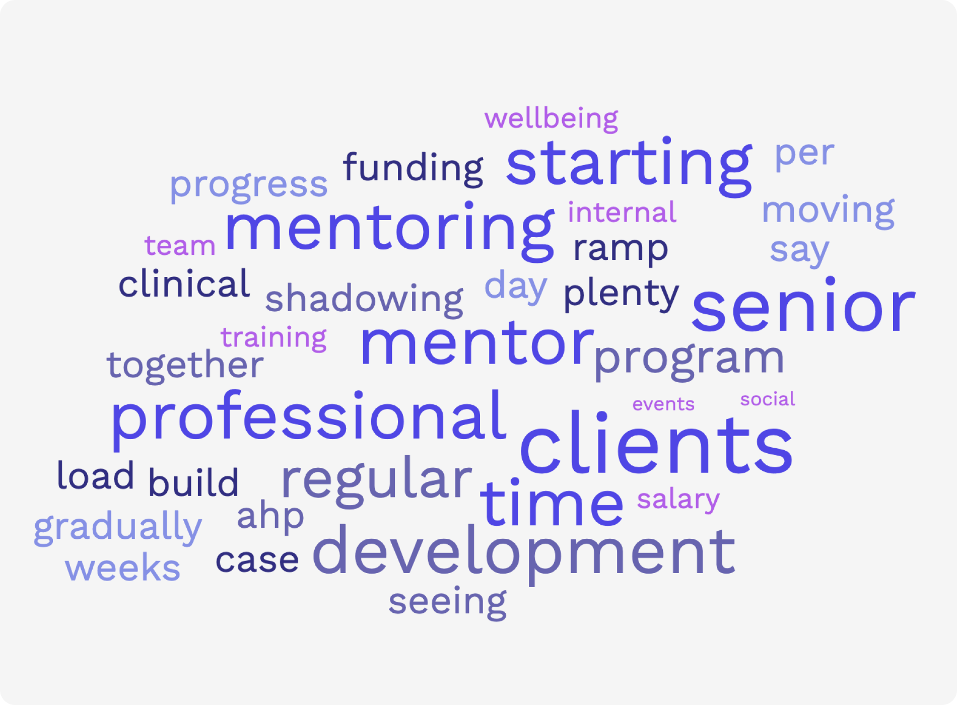
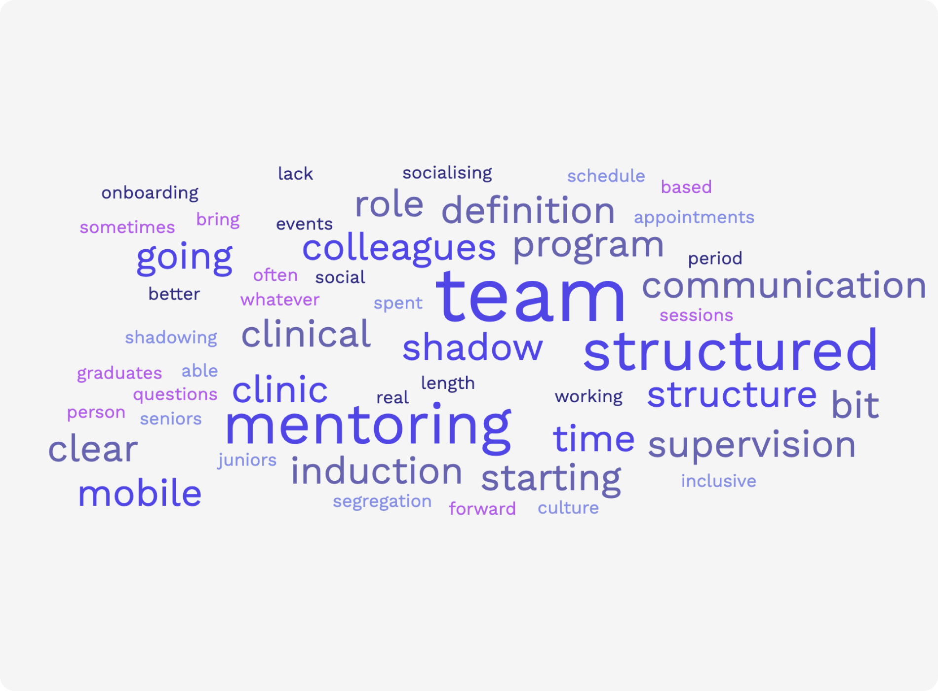
In order to synthesise the research we have obtained, we created an affinity map to identify the biggest clusters and most common themes, of what features AHAs and AHPs wanted from a graduate program. As I was synthesising the data, I came across common keywords that were continuously repeated, so I decided to put all the responses from the surveys into a word cloud to clearly indicate the most common keywords:
What AHAs:
Want in a graudate program
Think is the most valuable form of support
Think would be a 10/10 graduate experience

What AHPs:
Found was the most positive & valuable forms of support in their graduate program or first job
Think would be a 10/10 graduate experience
What AHPs:
Thought could have been improved or was missing from their graduate programs or first jobs
These word clouds show that ‘mentoring’, ‘support’, ‘supervision’, ‘team’ and ‘structure’ are the most repeated. It’s also interesting to note that what AHPs felt was the most valuable, was also what they felt was missing the most from their experiences. These word clouds help us to hone in on these specific areas.
02 - Synthesis
Key Pain Points
Through synthesis of the research we had gathered, we identified 4 key pain points:

New graduates feel as if they do not receive the level of clinical support necessary with regards to 1:1 mentoring, supervision, case reviews and feedback from senior clinicians. This leads to pain point #2.
Lack of Support & Feedback

New graduates feel unprepared to see clients independently as they don’t feel adequately trained or supported to provide care end-to-end (i.e. paperwork, processes, clinical knowledge)
Unprepared for independent practise

Due to the nature of a mobile clinic, AHPs often feel isolated with a lack of connection with their team.
Feeling isolated

New graduates feel frustrated with the lack of structure in their first jobs which leave them uncertain of their role and expectations, and the goals they need to achieve and work towards.
Lack of structure
The Problem
Newly graduated allied health professionals feel inexperienced and anxious about transitioning into their first full time job and want access to support, information and knowledgeable professionals.
02 - Synthesis
Introducing Immy
We developed a persona to be representative of all our synthesised research which also helps us clearly define who we are designing for. Moving into the ideation phase, our designs will aim to solve Immy’s frustrations, and address her needs and wants.

03 - Ideate
Brainstorming Ideas & Solutions
In order to generate ideas, we ran an ideation workshop with Immy and brainstormed around 2 How Might We questions:
How might we provide a supportive experience for graduates through a graduate program?
How might we help a graduate feel confident and prepared for their first solo client session?
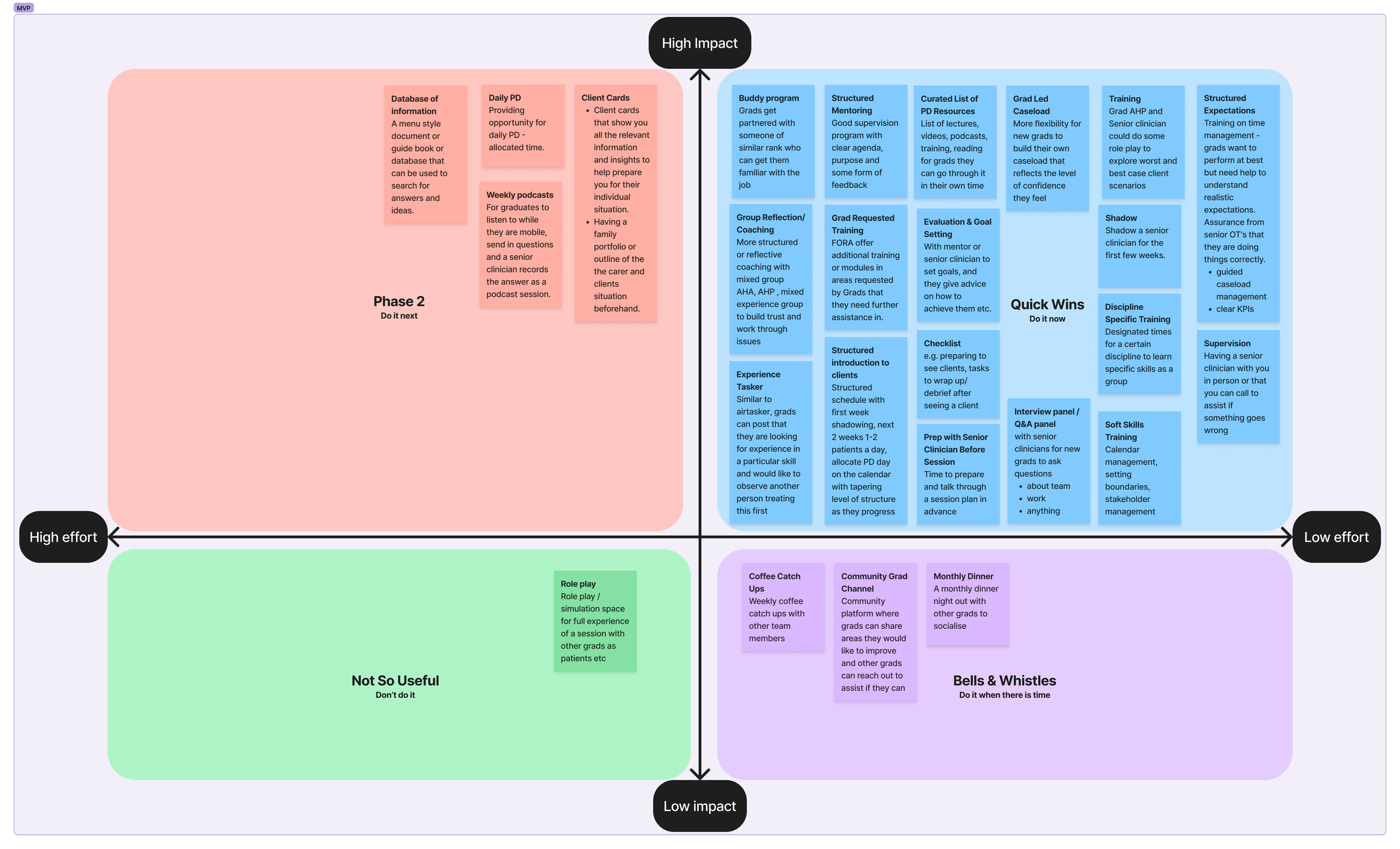
Based on the ideas generated and voted on by the Immys we placed them on a Minimum Viable Product (MVP) matrix, which considers the level of effort and value each idea has. We focused on the ideas that were Quick Wins, meaning they are low effort but have high value.
03 - Ideate
Concept Testing the Ideas
We wanted to make sure that each feature included in the graduate program would truly contribute to creating a 10/10 graduate experience for Immy, and address her needs and wants, along with her pain points. We concept tested these features with 7x Immys and asked them to rank how important each feature was in a graduate program on a scale of 1 - 10. 1 being ‘not essential’ and 10 being ‘absolutely essential’.

Results validated our research that the following features were most important to Immy:
Discipline specific clinical training
Request cases of interest
A structured program manual
Based on the results from the concept testing, we decided to exclude:
A monthly Q&A podcast
Graduate passion project
Wellbeing seminars
03 - Ideate
The Solution
Based on the results from concept testing and the key features that Immy would find most valuable, we crafted the 12 month roadmap.
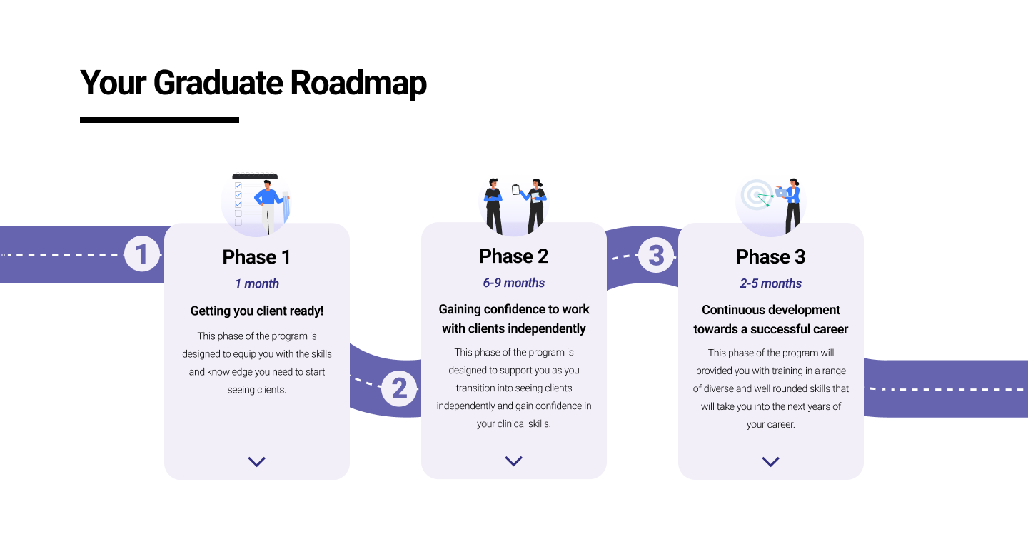
We decided on 3 distinct phases for the 12 month graduate program. This creates structure and a clear outline for the year, which is one of the pain points that Immy has.
It also provides a straightforward overview of the program for graduates researching on the webpage.
03 - Ideate
The Specifics
Let’s breakdown each of the phases and some of the key features that are present in those phases, and why we decided to include them:


As part of induction and onboarding, grads are assigned a buddy who is 1 - 2 years into their career to give support as they transition and answer their questions
This addresses the pain point of lack of support
"Having someone 1 year ahead, that’s useful, easy relationship"

Teaching soft skills like calendar management, client forecasting, case management skills etc.
This addresses the pain point of not prepared for independent practise
"Unspoken skills they don’t talk abut in uni that you need to apply in your grad role"


A senior clinician will support grads as they prepare a session plan and then debrief with them after, so they go into the client session feeling supported, and will receive feedback to improve after.
This addresses the pain point of lack of support and feedback and unprepared for independent practise
“If I do something wrong or right at least I'll get feedback"

With the support of their mentor, graduates can choose to decide when to increase their caseload based on how prepared and confident they feel to support those clients
This addresses the pain point of unprepared for independent practise
“Slow integration into a full caseload. Not being thrown into the deep end, but rather slowly increasing client base over time"


Experienced senior clinicians will hold workshops on specific core topics related to each discipline e.g. for Occupational Therapists training could include various home modification techniques
This addresses the pain point of feeling unprepared for independent practise
Rated 9.14/10 important feature in a graduate program

Mentors will work with graduates to develop a plan for the upcoming year which includes goals and actions grads want to achieve include any career specialty pathways etc.
This addresses the pain point of lack of structure
Rated 7.28/10 important feature in a graduate program
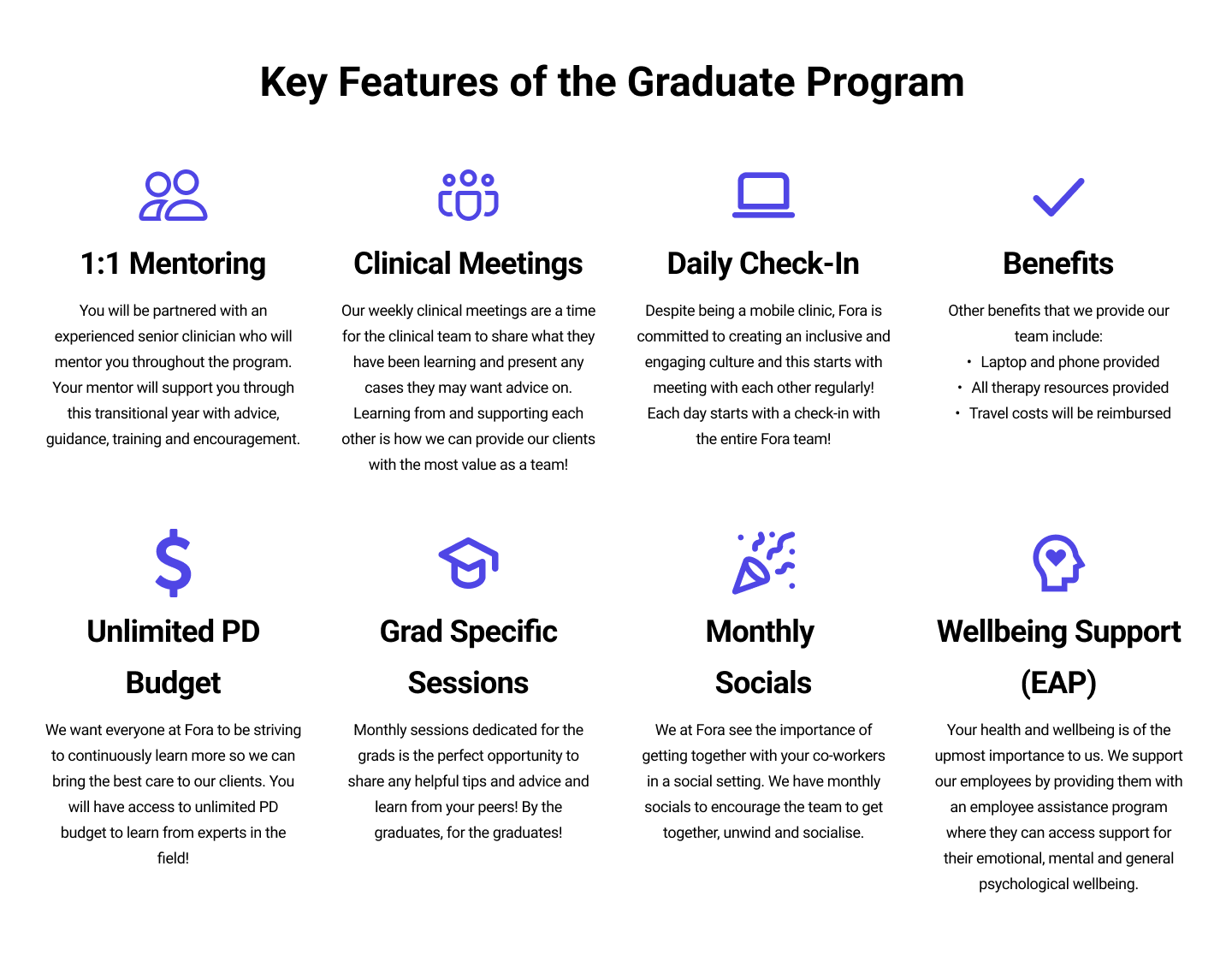
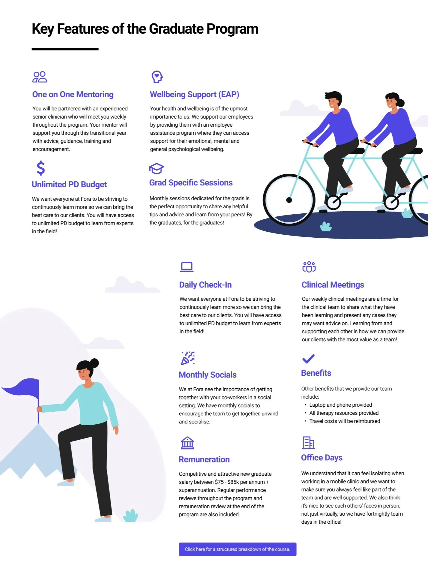
Recurring & Key Features

Monthly team socials to encourage the team to get together, unwind and socialise in a non-work setting to foster relationships in a more relaxed environment
This addresses the pain point of feeling isolated
“As a mobile clinic we don't get to see our team in person very often. Sometimes the job can get a bit lonely if you haven't developed a good relationship with your team yet in the first few months.”

A structured manual will be provided that includes processes and procedure guidelines, checklists to prepare for client sessions, list of training and resources etc. means a grad will always feel prepared and know what to expect next.
This addresses the pain point of lack of structure
“I think it was sort of just frustrating learning that stuff after you have already started with a client, I wish I knew that beforehand”
04 - Validate
UI Design Iterations
Based on the results of the concept testing, we moved on to designing the UI of the webpage, that would demonstrate the features of the graduate program, and collect sign ups. My main focus was presenting the key features of the program, along with a more detailed breakdown of what each feature entailed.
Iteration #1

Iteration #2
Iteration #3
Iteration #1 —> Iteration #2
Iteration #1 is similar to the way competitors display key offerings and how Fora currently display information on their website.
From Iteration #1 to Iteration #2 added Fora’s secondary colour to draw the attention to the key features and changed the layout of the features to allow for graphics that elevate the visual design of the section.
Iteration #2 —> Iteration #3
From usability testing, the dark background made the information difficult to read and was a sensory overload. Therefore, I changed the background to white, which is more consistent with Fora’s current website.
Moved the information hierarchy of the features to highlight the most important and valuable ones at the top based on feedback.
Through testing we found the webpage was missing key information such as remuneration details which was then included in Iteration #3.
04 - Validate
Usability Testing of the Interface
Key results from our 2nd round of usability testing also showed that:

expressed confusion or struggled to understand certain phrasing/abbreviation used to describe the program features.
said they felt the webpage was too wordy "I would probably just click away [if faced with this much text straight away]"

said they liked the page layout and flow of information.
04 - Validate
Latest Iteration
Therefore, we took into consideration the results from the usability testing and made changes to get to our latest iteration.
The key focus area was on the copy of the graduate program details, and making sure the descriptions were not too overwhelming yet still communicated the program clearly.
Project Outcome
“Tasha led her team to deep dive into our problem scape, gaining an impressive understanding of our very niche users. Despite facing a challenging project brief that spanned service design, UX and UI design, she and the team went above and beyond to deliver creative solutions that addressed multiple needs in our business, producing work that was essentially build-ready.”
- Bec Leong, UX Researcher/Designer @ Fora
04 - Validate
Measures of Success
To measure the success of the graduate program itself, as well as webpage showcasing the program and collecting sign-ups, I would evaluate the following:
The number of expression of interests received through the webpage
Quantitative and qualitative feedback from graduates at the end of the program
Number of graduates who stay with Fora after their graduate year
For specific features such as graduate led increase in caseload, review whether expected billable hours were impacted positively or negatively
Next Steps
The beauty of design is that there is always an opportunity to reflect, iterate and then improve. After performing a retrospective, I’d like to work on the following as next steps for this project:
01
Focus on Taxonomy
Through testing, we found that some of the terms used were not easily understood or understood differently between the participants. Therefore, performing a card sorting session would help us better organise the information architecture of the page and better communicate the features of the graduate program in an easily understandable way.
02
Further Usability Testing
The latest iteration had changes to the way the features of the grad program were presented with the copy minimised as to not overwhelm the reader. However, this should be tested to ensure that readers still understand the features of the program or whether the descriptions require further iterations.
05 - Reflect
My Personal Retrospective
At the end of this project, I took some time to personally reflect on what I have learnt from this project, which includes:
Watch out for feature creep - as we dug deeper into what features could be included in the program, we found ourselves wanting to design a podcast, a learning portal, a handbook etc. It’s important to remain focused on the current iteration and to re-visit the brief often, to stay focused on the task at hand, and more importantly to remain on time and within budget.
Put your bias aside - I learnt not to get too attached to ideas that might come up, because even though we particularly liked some ideas and thought they were going to be valuable, through concept testing we found they were actually the lowest voted on features.
Test early, test often - something that we did well in this project, which I had learnt from past projects is to test concepts before you get too deeply invested in the UI designs. By concept testing via a survey during our first iteration, we were able to quickly cut features that the testees did not value which saved a lot of time.