Feed Me.
A Google Maps feature to help those with dietary requirements quickly find suitable places to eat.
Overview
Feed Me is a personal mobile app project. Its goal is to help individuals with dietary requirements to easily find places they can eat at.
This personal project came about when I organised group dinners with friends who have dietary requirements, it always took such a long time to research places with suitable options on the menu for them. They often felt left out and weren’t able to enjoy their time if there wasn’t anything they could eat.
Product Designer
Role
Duration
3 weeks
Survey, 1:1 Interviews, Wireframing, Prototyping, Usability Testing
Responsibilities
Tools
Figma, Miro
The Problem
People are frustrated with finding restaurants which cater to various dietary requirements and want to be inclusive of all attendees, but need a faster and more convenient way to search for the right restaurants.
01 - Research

Understanding Dietary Requirements
To remove bias from my own experience of eating out with my friends, I set out to learn more about others with dietary requirements and their experiences. I conducted a survey, and received 99 responses, with some key results being:
don’t order anything if there is nothing suitable on the menu
41%
would cater to those with the dietary requirements when eating out in groups
73%
rated the experience of eating out with a dietary requirement a 1 out of 5
35%
I conducted some desktop research to better contextualise the problem in Australia. This desktop research showed me that many Australians live with a dietary requirement and dining out is a top choice of leisure activity for the average Australian.
25% of the population have a food intolerance

4M Australians are gluten free, with 1 in 70 having coeliac disease

~2.5M Australians are vegan or vegetarian

the average Australian household spends $100 a week on eating out

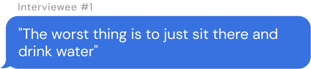
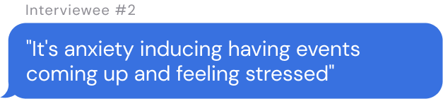
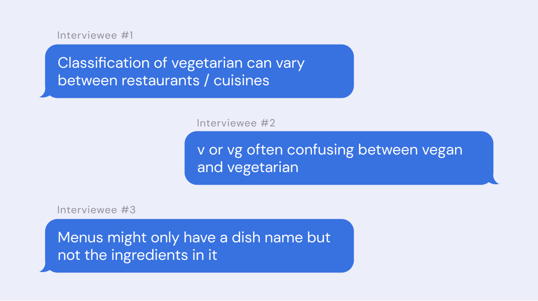
To better understand the pain points of eating out with a dietary requirements, I interviewed 10 participants including coeliacs, vegans and vegetarians. Some key things they said were:

01 - Research
Research —> Pain Points

After synthesising all of my research through an Affinity Map, the two biggest clusters that emerged were:
preparation and planning
nothing suitable to eat
And the key pain points of these themes were:

It’s time consuming to find a place with suitable options - makes them feel frustrated
Time Consuming

Menus are confusing and don’t clearly label between vegan/vegetarian or outline the GF options - makes them feel annoyed
Lack of Clarity

They don’t trust or feel comfortable the food is truly coeliac or vegan/vegetarian - makes them feel anxious
Lack of Reliability
I found that the biggest pain point for those with dietary requirements wasn’t unsupportive or friends who weren’t inclusive and considerate like I had hypothesised, but rather;

it was difficult to even find a place to eat with suitable options in the first place.
Searchability
These key pain points led me to pivot and reframe my problem statement.
Australians with dietary requirements find it difficult to find restaurants they trust and feel comfortable at, which cater to their needs
The Revised Problem
02 - Synthesis

Key Insights
Therefore, the key insights I have gathered from my research were:
one.
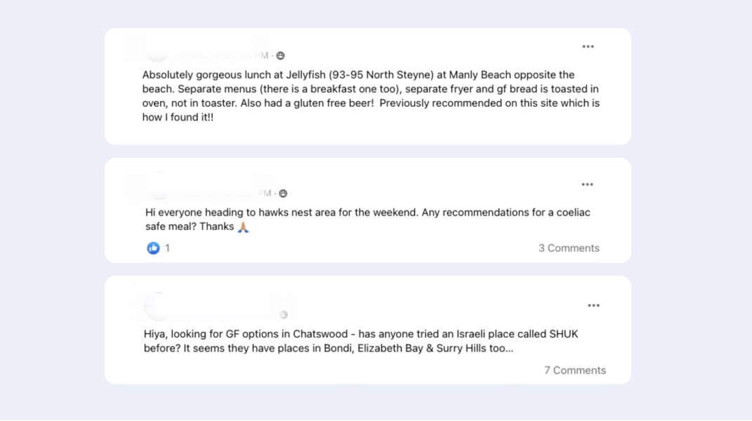
“I will 100% trust recommendations from Facebook group”
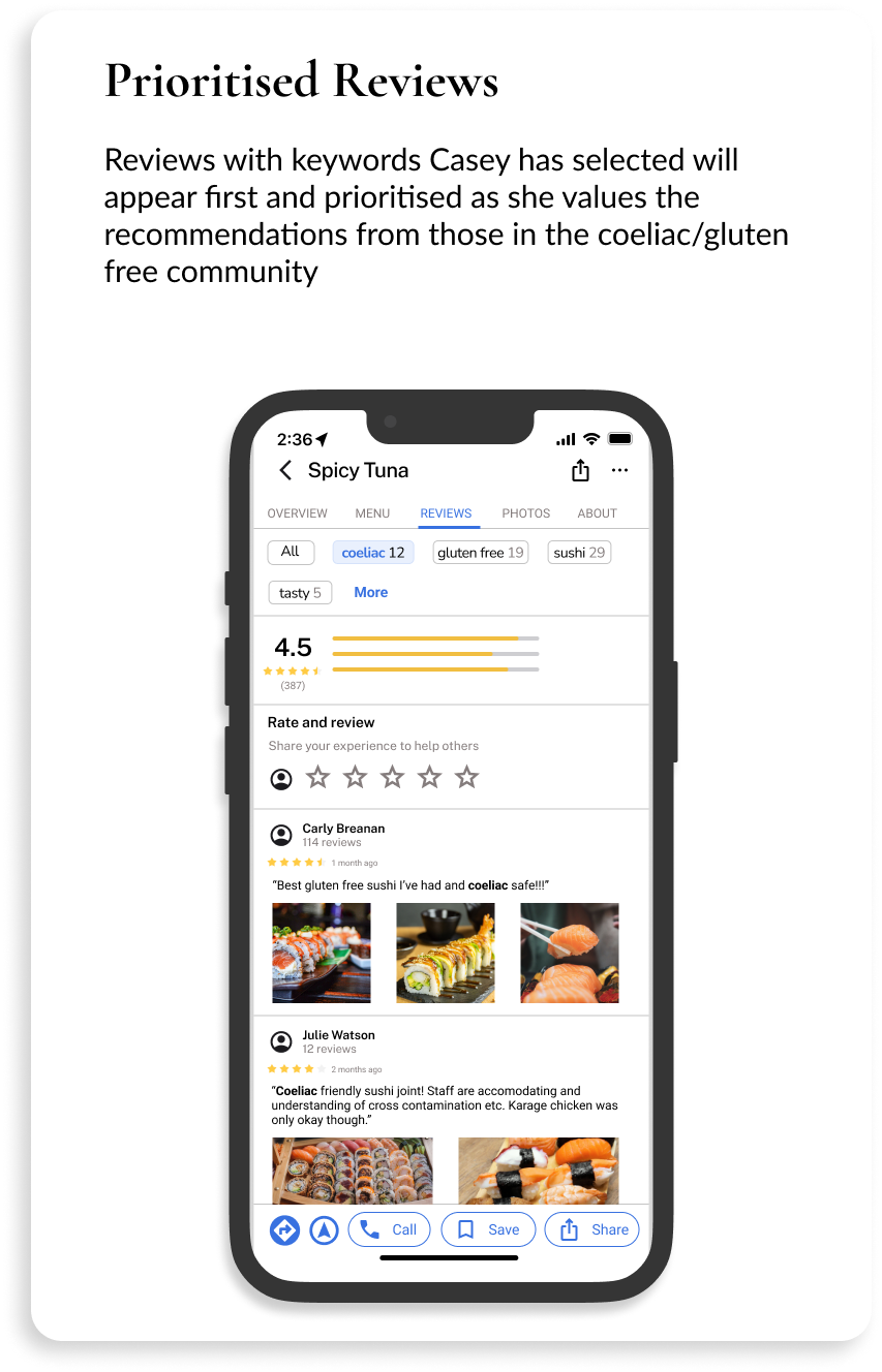
Participants trusted restaurant reviews and recommendations that came from others that live with coeliac disease or are also vegan or vegetarian.
They often posted on Facebook groups for recommendations or scrolled through the groups to find places to eat. I joined these Facebook groups for a month, and saw many posts asking for recommendations.
two.
“I don’t use apps even though I know they exist”
Participants knew of apps that could help them find restaurants based on their dietary requirements, but do not use them.
Most participants started with a general Google search and preferred looking through Facebook groups for recommendations.
three.
“looking through the menus can be annoying if it’s not clearly labelled”
Participants were frustrated that menus did not list ingredients or clearly label whether dishes were vegan, vegetarian or gluten free.
Most participants have to call ahead to the restaurant to confirm options they will be able to eat, or with the wait staff and chefs at the restaurants.
02 - Synthesis
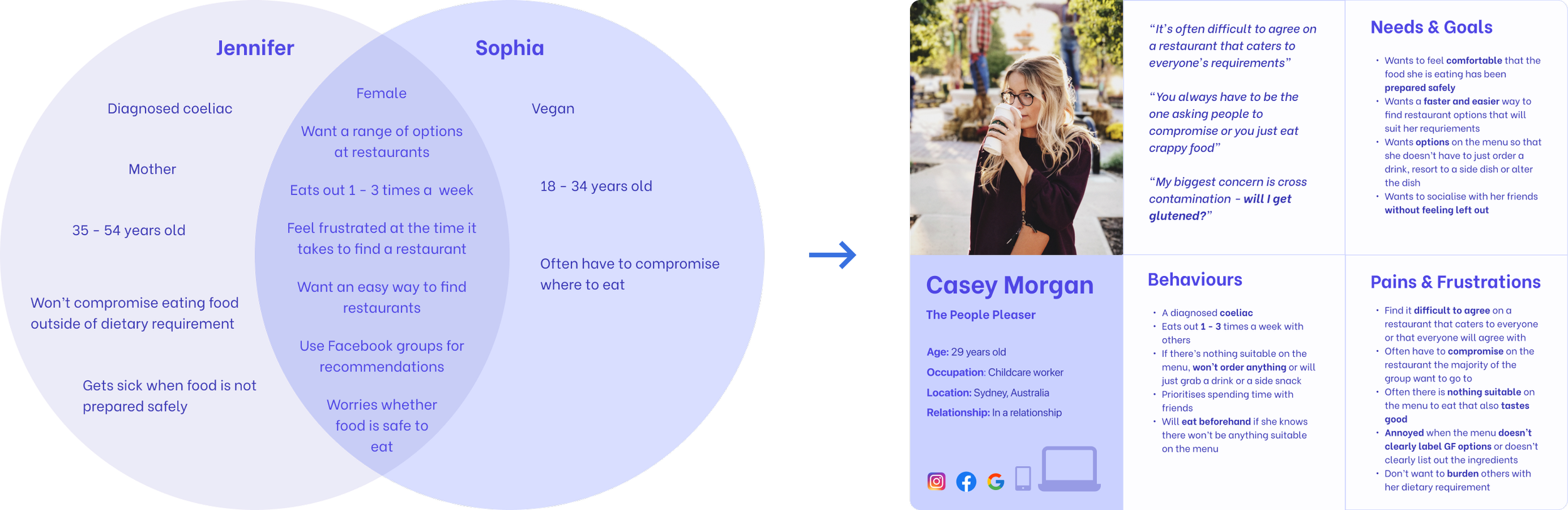
The Making of a Persona
In order to create more focused designs, I worked on creating a persona to summarise the key pain points and needs from my synthesised research. Originally I had 2 personas in mind from the research I had gathered. However, through synthesis, I realised these were actually the same persona, struggling with the same pain points and sharing the same goals and needs.
03 - Ideate

Brainstorming for Potential Solutions
In order to generate ideas, I ran 2 ideation workshops with the personas. I used 2 How Might We questions in order to brainstorm some ideas that could help Casey’s pain points. I used an analogous question that is similar to the problem scenario to get the personas out of their biases. The solutions they came up with for the analogous question drew parallels to the problem scenario.
How might we help Casey find more suitable food options so she can enjoy her time out?
01
How might we help someone find good activities for a first date?
02
I placed the ideas generated on by the personas on a Minimum Viable Product (MVP) matrix. Each idea is placed on the matrix based on its effort and value. I focused on the Quick Wins quadrant which comprise of ideas that are high value and also low effort. For this personal project, I focused on 2 ideas, below.
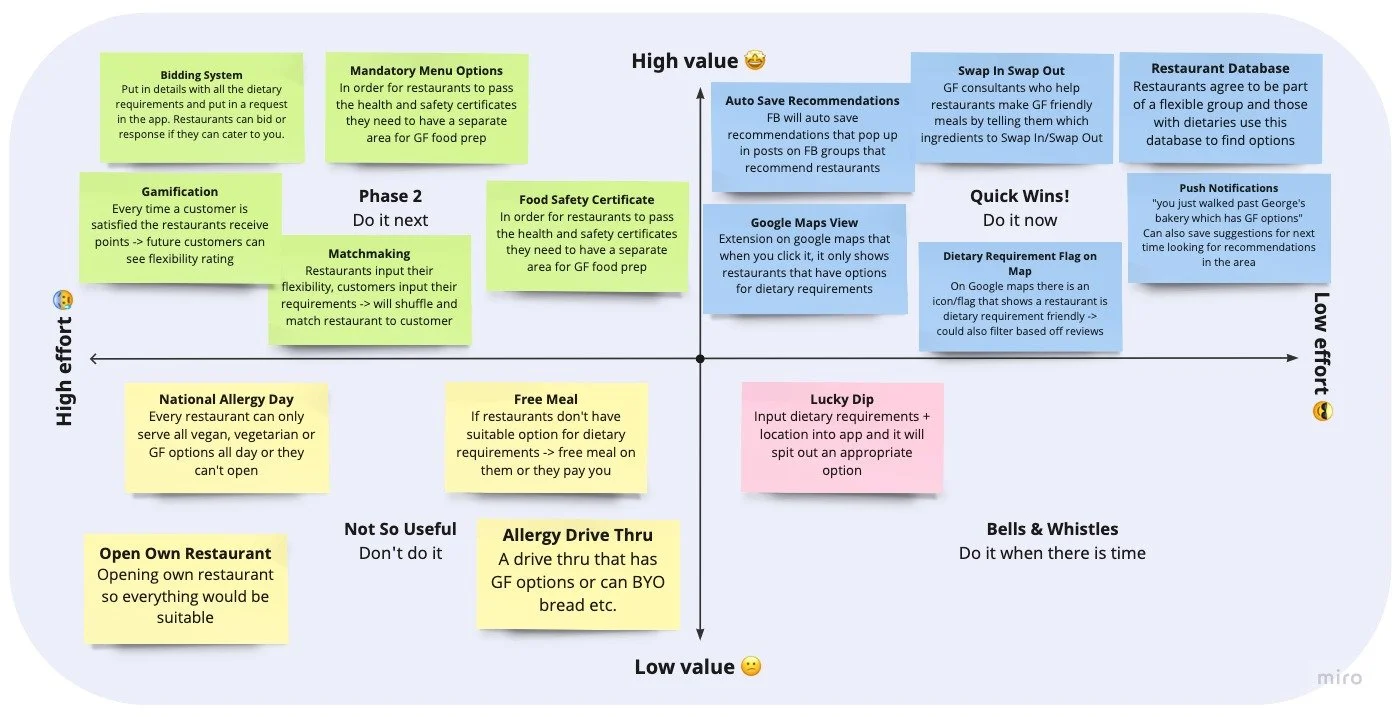
Dietary requirements flag on Google Maps that indicate suitable restaurants based on your dietary requirement

Push notifications for when you walk past a restaurant with suitable options

03 - Ideate
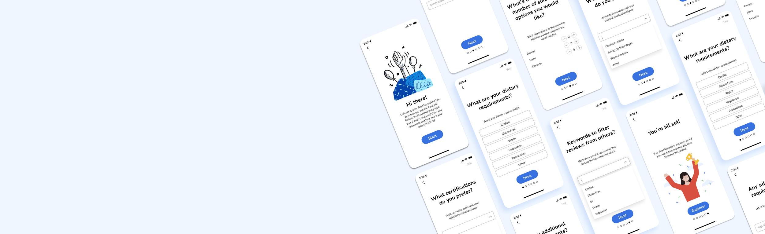
The Solution
The ‘Feed Me’ feature, conveniently integrated as part of Google Maps, allowing Casey to search for suitable restaurants and receive tailored results. From Insight #2, I knew that Casey doesn’t want to use another app to find restaurants, so I decided to integrate a feature into an existing app she already uses, Google Maps.
01 Tailored Results


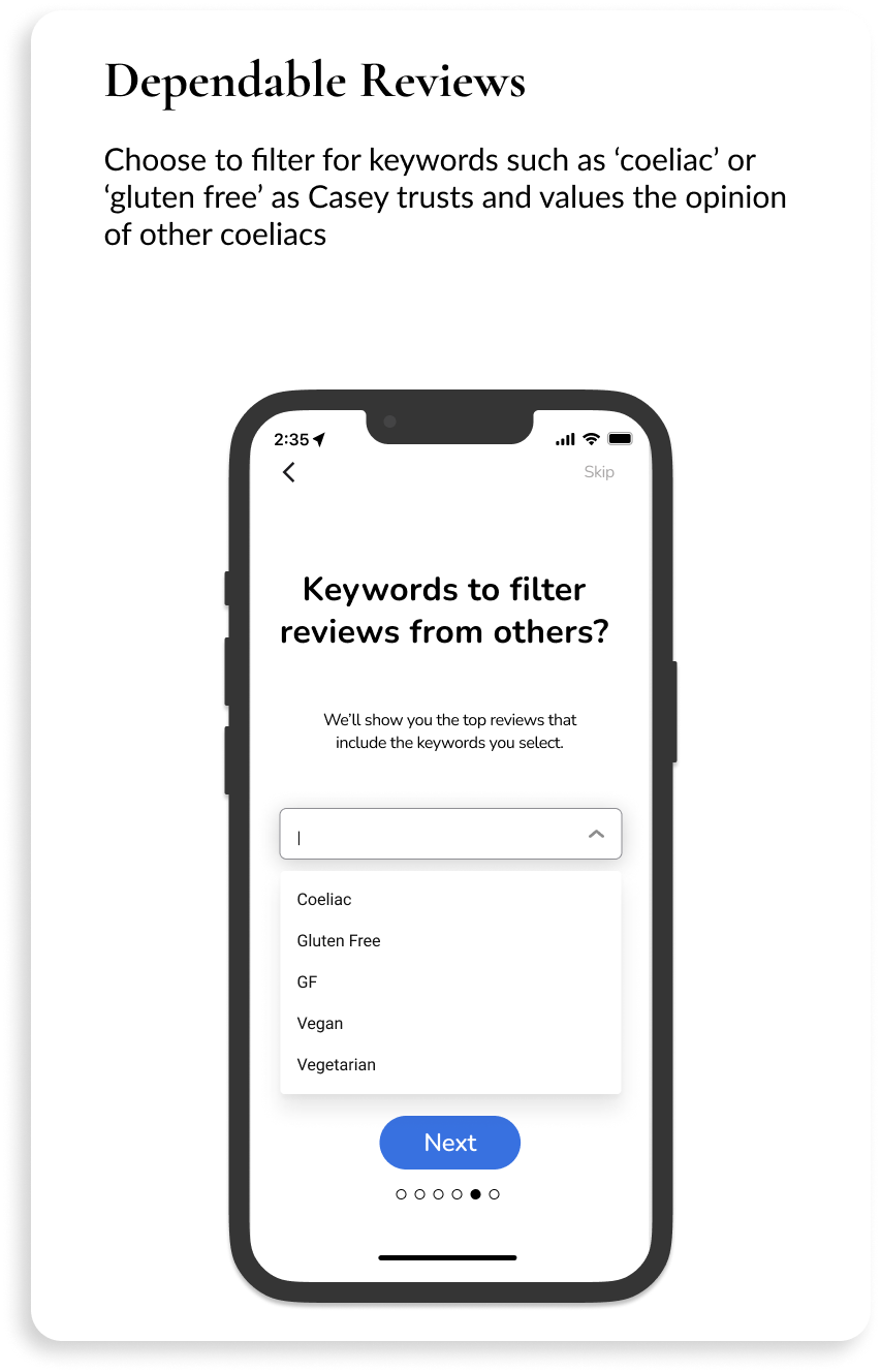
The criteria and filtering would address the following pain points:
Time consuming to find a place with suitable options
Menus are confusing and don’t clearly label between vegan/vegetarian or outline the gluten free options
Don't trust or feel comfortable the food is truly coeliac or vegan/vegetarian
02 Simplified Search


03 Ongoing Engagement

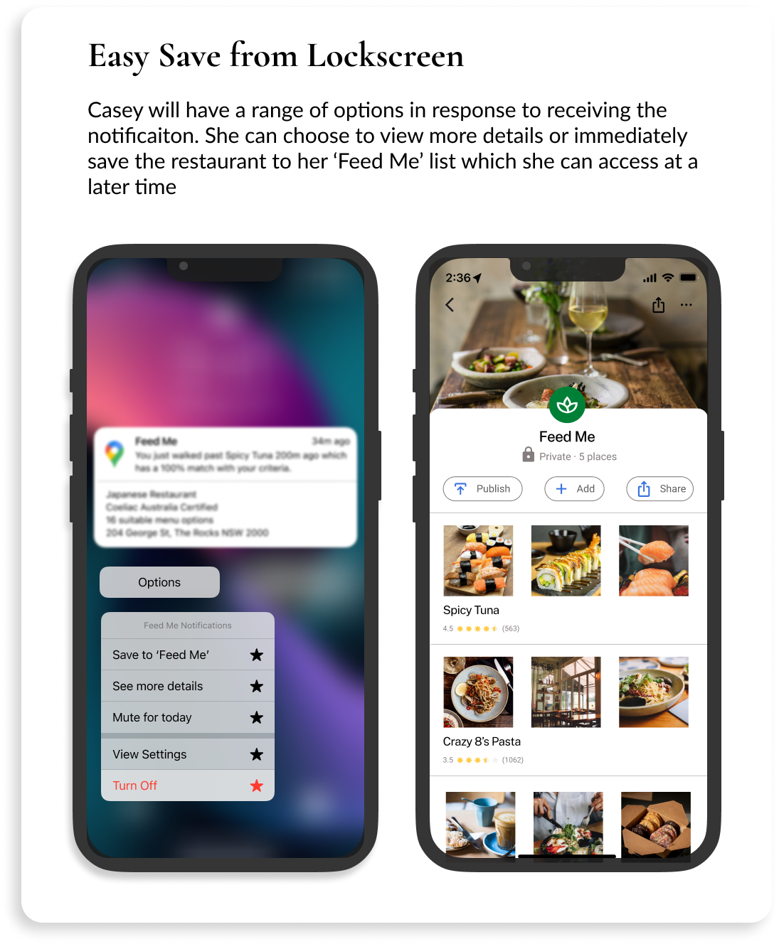
This notification feature would address the pain point that it’s time consuming to find a place with suitable options. By notifying users when there is a restaurant that matches their criteria, they are able to quickly view a saved list of restaurants that they know is already suitable based on their criteria.
04 - Validate

Key design choices
Overview Screen
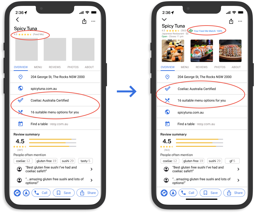
Re-arranged information on the screen
“I would want to see the 'Coeliac Australia certified' at the top with the suitable menu options”
Therefore, I moved these closer to the top of the page as it is more valuable information to the user
Changed from star rating to percentage match
"Don't understand the star rating, is it different to the Google review ratings?"
I changed this to a percentage match that identifies how closely a restaurant matches the user’s ‘Feed Me’ criteria to avoid confusion as users already have a perceived understanding of star ratings on Google.
Feed Me Feature
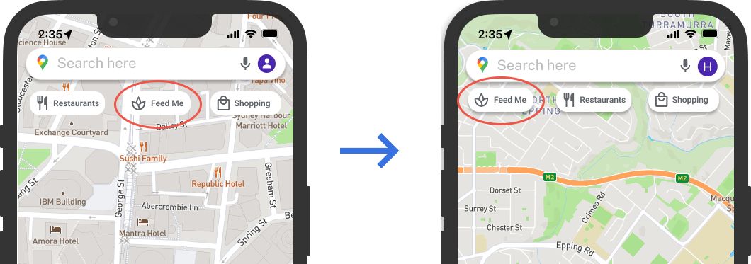
Re-arranged ‘Feed Me’ button
"As I haven't used this before, I'd try find the feature under 'restaurants'"
3/5 Casey’s did not find the ‘Feed Me’ button within the first click
Therefore, I moved the ‘Feed Me’ button to the very left
After a second round of testing, 3/6 Casey’s still did not find the ‘Feed Me’ button within the first click
This function still requires further iterations and testing in order to find the right way for Casey to naturally navigate to the ‘Feed Me’ button within the first click.
Notification Details


Added more details to the notification
"A summary on the notification would help me understand if I'm keen to eat there"
I added more details to the notification description to help users decide whether they want to take action and save the restaurant.
Added feedback to the notification actions
“There’s no feedback that it happened”
I added feedback interaction so Casey would know when she has taken an action such as saving the restaurant
04 - Validate
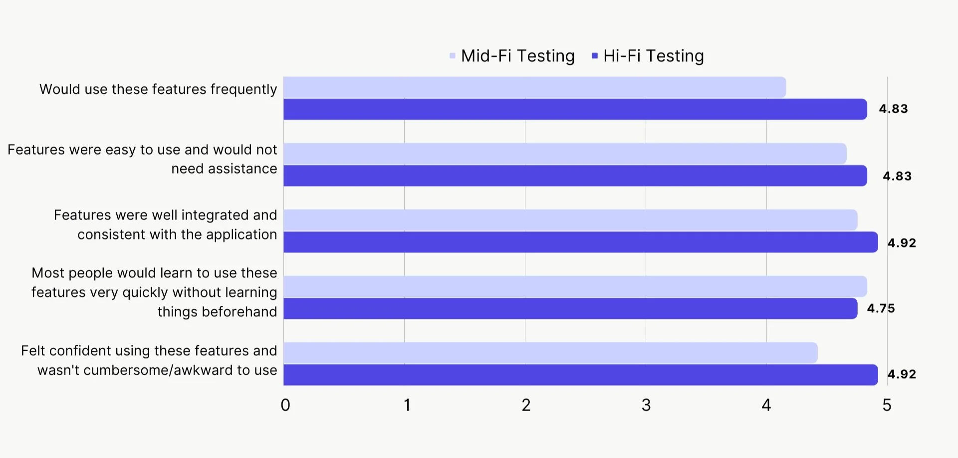
Testing Results
After each usability testing session, I asked each Casey to fill out a survey asking questions that would provide quantitative results.
I compared the results from mid-fidelity testing and hi-fidelity testing and see that scores increased in each category except for ‘features were well integrated and consistent with the application’.
04 - Validate
Measures of Success
In order to understand whether the Google Maps Feed Me feature solves the pain points of those with dietary requirements, I would consider the following:
Number of users who set up a ‘Feed Me’ criteria
1
Number of times the Feed Me search is used
Number of saves from notification alerts
3
2
Design is Always Iterative; The Next Steps
The beauty of design is that there is always an opportunity to reflect, iterate and then improve. After performing a retrospective, I’d like to work on the following as next steps for this project:
01
Research Google Maps Usage
Research how Casey uses Google maps normally i.e. does she start on Google search and then click links that direct her to Google Maps or does she start by searching in Google Maps? This would help determine where to best place the ‘Feed Me’ button and reduce the length of time it takes to find the feature.
02
Usability Test on a Mobile Device
Testing the Figma prototype on a mobile device would better help me understand how users interact with the features when using their fingers to swipe and tap rather than a mouse to click or drag.
05 - Reflect
My Personal Retrospective
At the end of this project, I reflected on what I had learnt and what I would change for next time:
Have a clean Figma file - using frames and layers and keeping everything labelled will save you a headache later on
1
Don’t forget accessibility standards - make sure that all buttons, fonts, texts are in line with best practice and according to WCAG guidelines
2
Have clear testing objectives - at the end I realised I could have achieved more out of my usability testing session had I set out clear objectives I was trying to achieve, including intentional activities to test
3
As this was my first ever UX/UI project, the biggest thing I learnt is that I really enjoyed deep diving into a problem space I originally didn’t know much about, chatting to people about it along the way, and turning the insights I’d gathered into a meaningful design that would create true value for the user.
Icons on this page by Icons8